
Creating an Accessible Accordion Component in Astro
Learn how to create an accessible accordion component with smooth opening and closing animation. Created using HTML, CSS (Tailwind), and JS.

•
6 min read
Accordions are a very popular component in websites for dropdown menus, and FAQs. They allow you to hide content until a user clicks on a button, which then reveals the content. This is great for hiding content that is not immediately relevant to the user, but that they may want to see later.
TIP
My new open source component library Starwind UI includes a much improved and pure Astro accordion component! Check it out here.
We’re going to make an accordion component that animates on opening (slides open and closed), and is accessible for screen readers. We will use HTML, CSS (Tailwind), and JS to create this component. In the end you’ll have a nice Astro component to use in your projects.
Requirements
Astro 3.0
Install or update Astro in your project to the latest version with npm install astro@latest.
Tailwind CSS
Install within your Astro project with npx astro add tailwind.
astro-icon
Install this package in your project with npm install astro-icon. It just makes it easier to use SVGs from Iconify. You don’t NEED to use this, and could just copy an SVG in that you like.
HTML
The core html markup is:
<div class="accordion">
  <button
    class="accordion__button"
    id="accordion-1-button"
    aria-expanded="false"
    aria-controls="accordion-1-content"
  >
    <!-- accordion title -->
    <svg class="accordion__chevron">
      <!-- chevron SVG -->
    </svg>
  </button>
  <div
    class="accordion__content"
    id="accordion-1-content"
    aria-labelledby="accordion-1-button"
  >
    <!-- accordion content -->
  </div>
</div>
Adding more details like props and tailwind classes, we get the accordion.astro file:
---
import { Icon } from "astro-icon";

interface Props {
  title: string;
  details: string;
}

const { title, details } = Astro.props as Props;
---

<div class="accordion group relative rounded-md border border-purple-900">
  <button
    class="accordion__button flex w-full flex-1 items-center justify-between gap-2 p-3 text-left font-medium transition hover:text-purple-500 sm:px-4"
    type="button"
    id={`${title} accordion menu button`}
    aria-expanded="false"
    aria-controls={`${title} accordion menu content`}
  >
    {title}

    <!-- if using astro and the astro-icon package -->
    <Icon
      name="tabler:chevron-down"
      aria-hidden="true"
      class="accordion__chevron h-7 w-7 shrink-0 transition-transform"
    />

    <!-- use this is not using astro-icon (or another SVG you like) -->
    <svg
      class="accordion__chevron h-7 w-7 shrink-0 transition-transform"
      aria-hidden="true"
      xmlns="http://www.w3.org/2000/svg"
      width="24"
      height="24"
      viewBox="0 0 24 24"
      ><path
        fill="none"
        stroke="currentColor"
        stroke-linecap="round"
        stroke-linejoin="round"
        stroke-width="2"
        d="m6 9l6 6l6-6"></path></svg
    >
  </button>

  <div
    id={`${title} accordion menu content`}
    aria-labelledby={`${title} accordion menu button`}
    class="accordion__content hidden max-h-0 overflow-hidden px-3 transition-all duration-300 ease-in-out sm:px-4"
  >
    <p class="prose mb-4 mt-1 max-w-full transition-[height]">
      {details}
    </p>
  </div>
</div>
You’ll notice that the details div is hidden by default. We will use JS to toggle the hidden class on the details div when the button is clicked. We also have a transition and duration set of 300ms. We will make use of these to have a nice opening and closing animation.
JavaScript / TypeScript
We will use TypeScript to:
- Toggle the
hiddenclass on the details div when the button is clicked. - Toggle the
aria-expandedattribute on the button. This is important for screen readers. - Set the max height of the details div. This allows us to animate the opening / closing.
- Toggle the
rotate-180class on the chevron SVG to rotate it 180 degrees when the accordion is open.
<script>
  function accordionSetup() {
    const accordionMenus = document.querySelectorAll(
      ".accordion",
    ) as NodeListOf<HTMLElement>;
    accordionMenus.forEach((accordionMenu) => {
      const accordionButton = accordionMenu.querySelector(
        ".accordion__button",
      ) as HTMLElement;
      const accordionChevron = accordionMenu.querySelector(
        ".accordion__chevron",
      ) as HTMLElement;
      const accordionContent = accordionMenu.querySelector(
        ".accordion__content",
      ) as HTMLElement;

      if (accordionButton && accordionContent && accordionChevron) {
        accordionButton.addEventListener("click", (event) => {
          if (!accordionMenu.classList.contains("active")) {
            // if accordion is currently closed, so open it
            accordionMenu.classList.add("active");
            accordionButton.setAttribute("aria-expanded", "true");

            // set max-height to the height of the accordion content
            // this makes it animate properly
            accordionContent.classList.remove("hidden");
            accordionContent.style.maxHeight =
              accordionContent.scrollHeight + "px";
            accordionChevron.classList.add("rotate-180");
          } else {
            // accordion is currently open, so close it
            accordionMenu.classList.remove("active");
            accordionButton.setAttribute("aria-expanded", "false");

            // set max-height to the height of the accordion content
            // this makes it animate properly
            accordionContent.style.maxHeight = "0px";
            accordionChevron.classList.remove("rotate-180");
            // delay to allow close animation
            setTimeout(() => {
              accordionContent.classList.add("hidden");
            }, 300);
          }
          event.preventDefault();
          return false;
        });
      }
    });
  }

  // runs on initial page load
  accordionSetup();

  // runs on view transitions navigation
  document.addEventListener("astro:after-swap", accordionSetup);
</script>
INFO
I use a delay when closing the accordion to allow the animation to complete. This is because the hidden class is added immediately, which would cause the animation to not run.
Starwind UI
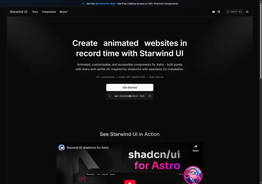
I've learned a lot developing with Astro. So I crafted 37+ animated and accessible components to help you get started with your next project. Inspired by shadcn/ui with seamless CLI installation. Free and open source.
Put It All Together
Here is the full Astro accordion component, which I conveniently name Accordion.astro.
---
import { Icon } from "astro-icon";

interface Props {
  title: string;
  details: string;
}

const { title, details } = Astro.props as Props;
---

<div class="accordion group relative rounded-md border border-purple-900">
  <button
    class="accordion__button flex w-full flex-1 items-center justify-between gap-2 p-3 text-left font-medium transition hover:text-purple-500 sm:px-4"
    type="button"
    id={`${title} accordion menu button`}
    aria-expanded="false"
    aria-controls={`${title} accordion menu content`}
  >
    {title}

    <!-- if using astro and the astro-icon package -->
    <Icon
      name="tabler:chevron-down"
      aria-hidden="true"
      class="accordion__chevron h-7 w-7 shrink-0 transition-transform"
    />
  </button>

  <div
    id={`${title} accordion menu content`}
    aria-labelledby={`${title} accordion menu button`}
    class="accordion__content hidden max-h-0 overflow-hidden px-3 transition-all duration-300 ease-in-out sm:px-4"
  >
    <p class="prose mb-4 mt-1 max-w-full transition-[height]">
      {details}
    </p>
  </div>
</div>

<script>
  function accordionSetup() {
    const accordionMenus = document.querySelectorAll(
      ".accordion",
    ) as NodeListOf<HTMLElement>;
    accordionMenus.forEach((accordionMenu) => {
      const accordionButton = accordionMenu.querySelector(
        ".accordion__button",
      ) as HTMLElement;
      const accordionChevron = accordionMenu.querySelector(
        ".accordion__chevron",
      ) as HTMLElement;
      const accordionContent = accordionMenu.querySelector(
        ".accordion__content",
      ) as HTMLElement;

      if (accordionButton && accordionContent && accordionChevron) {
        accordionButton.addEventListener("click", (event) => {
          if (!accordionMenu.classList.contains("active")) {
            // if accordion is currently closed, so open it
            accordionMenu.classList.add("active");
            accordionButton.setAttribute("aria-expanded", "true");

            // set max-height to the height of the accordion content
            // this makes it animate properly
            accordionContent.classList.remove("hidden");
            accordionContent.style.maxHeight =
              accordionContent.scrollHeight + "px";
            accordionChevron.classList.add("rotate-180");
          } else {
            // accordion is currently open, so close it
            accordionMenu.classList.remove("active");
            accordionButton.setAttribute("aria-expanded", "false");

            // set max-height to the height of the accordion content
            // this makes it animate properly
            accordionContent.style.maxHeight = "0px";
            accordionChevron.classList.remove("rotate-180");
            // delay to allow close animation
            setTimeout(() => {
              accordionContent.classList.add("hidden");
            }, 300);
          }
          event.preventDefault();
          return false;
        });
      }
    });
  }

  // runs on initial page load
  accordionSetup();

  // runs on view transitions navigation
  document.addEventListener("astro:after-swap", accordionSetup);
</script>
Great Success
Now you have a nice accordion component you can use in your Astro projects. It is accessible for screen readers, and has a smooth opening and closing animation. Great success. 🚀
Don't forget to follow me on Twitter for more Astro, web development, and web design tips!